Working through Force Directed Graphs
D3 is hard.
Data is wonderful, but I often find the post-analysis stage of communicating information difficult. I’m a firm believer in the principle behind the ELI5 (Explain Like I’m Five) subreddit, and I’d like to get better at being able to communicate concepts coherently in the most simple, efficient way. I came across work done by VisualCinnamon, and her incredible ability to communicate information through beautiful visuals opened up a whole new world, and gave me the language I needed to Google-search-tutorial my way through visualization.
So I started with this.
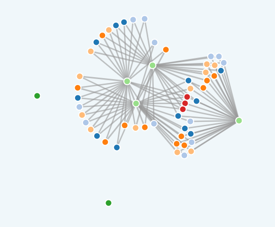
I hold music theory close to my heart, and really enjoyed this network of Jazz scale nodes (colored by scale type) built by R. Tyler McLaughlin. The edges connect scales that share 6 common tones; you can click and drag the nodes around and if you hover over the nodes, the name of the scale appears.
(Probably more fun on a desktop)
This is going to be messy, D3 is beautiful, but difficult.
Why did I rebuild this?
I’m thinking through how to apply a force-directed graph to health registry data, I think it’ll be a fascinating way to visualize relatedness, hierarchies, and options for dimension reduction. There’s some math I need to learn before, I’m probably just enjoying the aesthetics too much to realize that now. More to come.